Written by Sydney Burzynski, Founding Editor-in-Chief (2022)
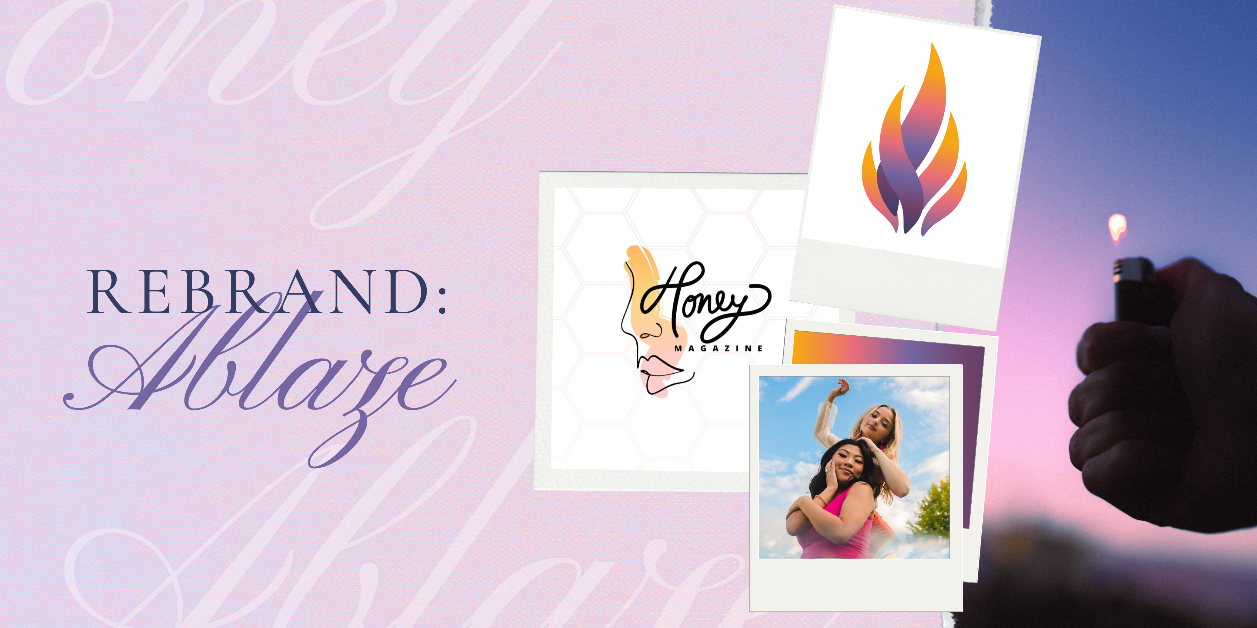
An insider view at the rebrand campaign and the process of going from Honey to Ablaze.
The Rebrand
A rebrand is a big change for any organization. It requires a lot of planning, decisions, and a balance between imagination and reality. Rebranding is essentially building an organization from scratch and the opportunities seem limitless. But that is not the case, in the real world, one must be knowledgeable of the limitations that exist when creating anything from scratch. While limitations often possess a negative connotation, they are actually advantageous to the creative process. It is in the restrictions and impediments that one has the opportunity to be most inventive.
The Name
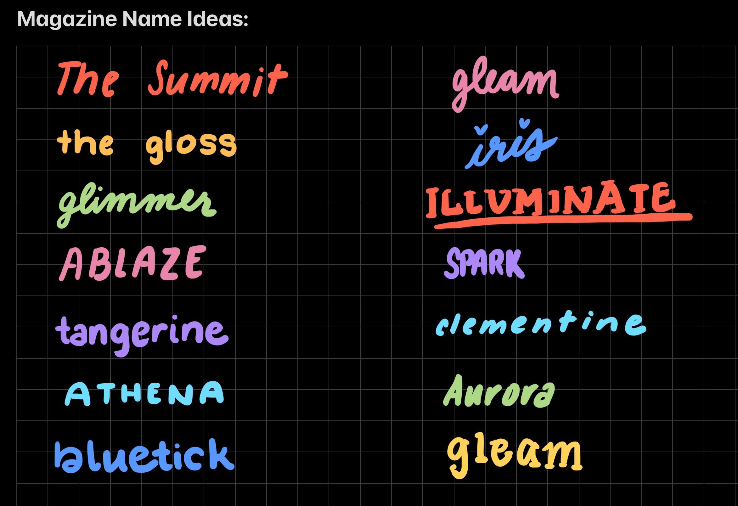
Choosing the new name for the magazine was not as easy as one might expect. The primary goals included being related to The University of Tennessee, while also being feminine. Those two requirements already limit the name pool significantly. Then, potential names had to be screened by several groups of people: the editorial team and the Office of Student Media. The final phase comprised of ensuring that the potential name was not already trademarked or in use by a similar organization or publication. Perusing through thesauruses, inquiring to loved ones, and fabricating mindmaps were some exercises conducted in order to generate an inventory of names. One viable thought process was using fire imagery, given its connection to the university as well as the other student media organizations. With several possible names lined up, ranging from Glimmer to Aurora, it was final decision time. After much consideration, the name Ablaze Magazine was selected and declared.
The Mission Statement
The new mission statement was built off of the foundation of the previous mission statement. With the introductory group of members, we had them analyze the copy that makes up the mission statements and values of our sister publications. Selecting words that stood out to the group, we curated a list of words, expressions, and phrases. Consequently, we cataloged key terms that we wanted to encompass the brand’s character. Words such as “empowerment”, “spotlight”, and “ambition” made it into the final draft. Ultimately, we composed a proclamation that was both impassioned yet succinct.
The Color Palette
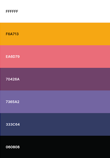
The color palette was derived from a series of photos that served as inspiration. Those photos featured fire, ranging from a spark to a roaring inferno. Unlike a traditional color palette derived from fire, we chose to focus on cooler tones – primarily blues and violets. This judgment was made for two reasons; the first being that the Honey Magazine color palette was made up of warm tones of pink, orange, and yellow. We wanted to set the precedence of distinguishing ourselves from Honey (the younger version of ourselves) and bring attention to how we have grown. Additionally, colors of blue and violet are rarely found in a flame (resulting in them being more eye-catching and thought-provoking), but they are also exemplary of the most scorching part of a conflagration. This choice was chosen deliberately, as we desired the magazine to burn as bright as an indigo flame and serve as a metaphor for our forthcoming success.
The Logo
Upon deciding upon the name of the magazine, similar to the color palette, the idea for the logo was obvious. With a name like Ablaze, the other branding components are easily visualized. The challenge comprised of presenting a fire in a unique, yet still recognizable way. Similar to any brand’s logo, this logo was created with a series of thumbnails that eventually morphed into the logo that Ablaze is known for today. Motifs of matches and sparks all made up the initial compositions. Rather than trying to reinvent the wheel, the idea of a flame stood out as both simple, yet effective. Next, there was extensive discussion and feedback surrounding seemingly frivolous details such as the types of corners of the flames (square versus bevel versus rounded) and the direction of the gradient. With the help of countless sketchbook pages and a couple of pencils, the magazine came to a group-wide decision. Looking at the final design, one can see that five flames make up the Ablaze fire. Each flame signifies an integral stakeholder in the magazine – the university, the College of Communication and Information, the Office of Student Media, the Knoxville community, and of course the members and contributors of the magazine. From there, the final design was constructed and produced in Adobe Illustrator, where it could then be transformed into a vector graphic. The full logo is made up of both a logotype and a logomark. Distinct versions of the logo, including various colors (full color, black/white, and monochrome) as well as separate renditions of the logo were created to accommodate all potential uses that may arise in the future.

The Next Steps
Upon the determination of these branding elements, a style guide was assembled in which the rules for portraying Ablaze’s brand were outlined for both internal users and external networks. The concluding component of the rebranding campaign is to implement the outlined changes. Establishing Ablaze’s brand identity will be accomplished by publicizing the magazine’s metamorphosis with the help of repeated exposure and generating brand awareness.
